The Accent Is the Alphabet Now: American Design's Bilingual Turn
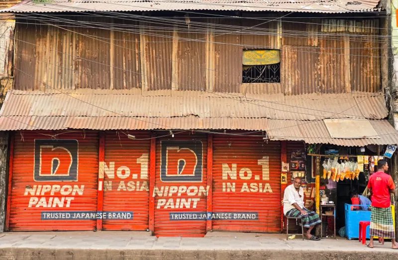
Walk through a neighborhood like Jersey City, Edison, or Fremont and read the signs. Not the words — the type. Devanagari curves sitting inside a Helvetica grid. Gurmukhi letterforms stretched across a sneaker collab. A bodega window where English and Gurbani script share space like they've always gotten along.
For decades, American graphic design treated scripts like these as decoration — the visual equivalent of a spice rack. Something you added for flavor. What's happening now is different, and it's worth saying plainly: the mixed-script, diaspora-inflected visual language isn't a trend inside American design. It's becoming American design.
From Flavor to Grammar
There's an old pattern in US commercial culture: borrow the aesthetic, credit no one, call it new. Paisley shows up on fast-fashion racks with no trace of its history. Henna patterns get slapped on festival merch. The culture becomes a filter, applied and discarded.
The current shift resists that pattern for one main reason: the people driving it have the pen. A generation of designers who grew up bilingual — fluent in American pop and in their parents' scripts, palettes, and patterns — are no longer asking whether their references belong in professional work. They're building the briefs.
That's the difference between an accent and a grammar. An accent decorates a sentence. A grammar writes it.
Who's Leading the Shift
You can trace the movement through the studios and independent designers doing this work on their own terms:
- Type designers building the fonts themselves. For years, the excuse was technical: there just weren't good Devanagari, Gurmukhi, or Tamil typefaces that could sit next to a Latin sans. That scarcity was a design failure, not a law of nature. A wave of South Asian and diaspora type designers has been fixing it — building multi-script families where neither alphabet is the awkward cousin. When the tools exist, the vocabulary spreads.
- Streetwear as the delivery system. Fashion has always been the fastest lane for visual language. Diaspora-led labels put Gurmukhi on a hoodie or a Tamil proverb across a chest, and suddenly the lettering isn't heritage-day content — it's what the most stylish person at the show is wearing. Streetwear doesn't ask permission; it sets the default.
- Studios that refuse the translation tax. The old model required diaspora design to explain itself — a caption, a footnote, a little 'inspired by' note for the mainstream audience. The studios leading now skip the footnote. The design stands on its own, and the audience catches up.
What Happens When the Accent Becomes the Standard
Here's the question worth sitting with: is this a win, a loss, or both?
The optimistic read: visibility compounds. A kid in Ohio sees Gurmukhi on a billboard and it's not exotic — it's Tuesday. Design literacy in multiple scripts becomes as normal as knowing what a burrito is. That's a genuinely better country.
The wary read: we've seen the extraction play before. Mainstream adoption can flatten mixed-script design into a vibe — 'global aesthetic' as a mood board — while the commissioned work, the type-design credits, and the creative direction still flow unevenly. When the accent becomes standard, who gets paid for the dictionary?
Both reads are true, and the difference between them isn't luck. It's structure. Credits in the case study. Type designers named in the press release. Contracts where cultural fluency is billed as expertise, not thrown in for free.
The Sentence Doesn't Translate Back
The deepest thing about a bilingual visual language is that it doesn't reverse-engineer into monolingual English. A Devanagari-Latin hybrid typeface isn't 'English with decoration.' It says things neither script says alone — the way a bilingual speaker's joke doesn't survive translation.
That's what makes this moment different from past waves of borrowed 'ethnic' design. The work isn't translating a diaspora experience for a mainstream audience. It's producing work that only makes sense if you accept the in-between as home — and increasingly, the American mainstream lives there too.
The accent was never a mistake in the pronunciation of American design. It was the pronunciation arriving early.